A shopper is seconds away from buying. They want to see the sofa in blue. The model takes four seconds to update, the swatches are tiny on their phone, and the page never showed up in Google for “design your own sofa” anyway. Each of those is a separate failure, and each one costs sales. This guide collects the 3D configurator best practices that prevent them: UX, mobile, rendering speed and SEO.
Quick answer: The best 3D configurators load fast, respond instantly to every option change, use familiar touch and mouse controls, and show a few clear choices at a time with live pricing. On mobile, design for thumbs first. For SEO, describe every option in crawlable HTML, add Product schema and keep Core Web Vitals green. The product should be the hero, not the interface.
Why UX Makes or Breaks a 3D Configurator
You can have the best 3D model in the world. If a shopper can’t figure out how to change its color, it’s useless.
Think of the configurator as a digital salesperson. A good one is fast, helpful and clear. A bad one is slow and confusing. Its only job is to move the shopper from curiosity to configuration to checkout.
Good configurator UX pays off in three ways:
- Less friction: fewer abandoned sessions and fewer support questions.
- More confidence: buyers see exactly what they are ordering.
- Ownership: people are more likely to buy something they helped design.
Forrester found that improving customer experience by a single point in its CX Index can drive more than $1 billion in revenue for large brands (Forrester, 2019). A configurator is one of the most direct CX levers an ecommerce store has.
Core UX Best Practices
1. Speed is the first feature
Nothing breaks immersion faster than lag. When a shopper taps an option, the change should appear instantly. Speed has its own section below because it matters that much.
2. Use familiar controls
Don’t make users learn a new control scheme. Stick to the conventions:
- Desktop: click and drag to rotate, scroll to zoom, right-click or Shift + drag to pan.
- Mobile: one-finger drag to rotate, pinch to zoom, double-tap to reset or zoom in.
Show a short, skippable hint on the first visit. Then get out of the way.
3. Organize options and limit choices
The option menu is the heart of the configurator. Group options logically: all colors together, all materials together, all sizes together. Use real material swatches, not just names. “Azure Blue” means nothing until you see it.
Too many choices at once cause paralysis. Hick’s law (Hick, 1952) shows decision time grows with the number of options. Use progressive disclosure: show popular options first, with “See more” for advanced choices.
4. Give instant visual feedback
The user should always know what happened:
- Update the model immediately after each selection.
- Mark the selected option with a checkmark or highlight.
- If a change needs a moment, show a small loader on the button, not a full-screen spinner.
- Update the price live next to the add-to-cart button.
5. Prevent invalid combinations
Use rules so incompatible options are hidden or disabled. “Engine X requires transmission Y” should be enforced by the configurator, not discovered by your sales team after the order. This removes misorders and the support tickets that follow.
6. Make saving and sharing easy
Let users save a design, share a link or email it to a partner. High-consideration purchases often involve more than one person. Saved designs also create remarketing opportunities.
7. Design for accessibility
Support keyboard navigation, screen reader labels for options and enough color contrast in the UI. The WCAG 2.2 guidelines (W3C, 2023) are the reference.
B2C vs B2B Configurator UX
The right UX depends on who is configuring.
| B2C | B2B | |
|---|---|---|
| Goal | Inspiration and emotion | Precision and accuracy |
| Tone | Visual, fun, shareable | Dense, technical, trustworthy |
| Key content | Style choices, live price | Specs, data sheets, compatibility rules |
| Main CTA | Add to cart | Request a quote or download spec |
B2C configurators should guide users quickly to a result they love. B2B configurators can show more information, but it must be impeccably organized.
Mobile 3D Configurator Best Practices
A mobile configurator is not a shrunken desktop version. Design for the small screen first, then scale up.
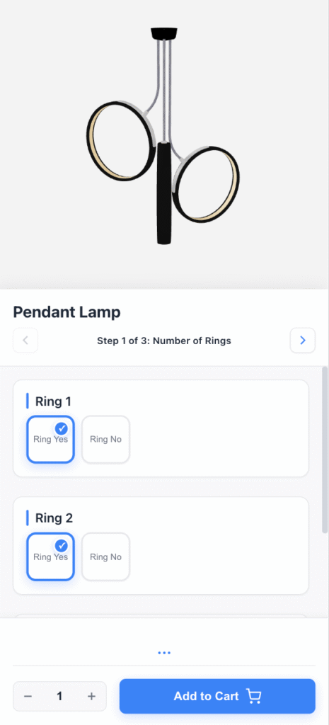
Design for thumbs, not mice
- Large touch targets: swatches and buttons big enough for a thumb. Apple’s Human Interface Guidelines recommend at least 44 x 44 points.
- Thumb zone: put primary actions like options and add to cart near the bottom of the screen.
- Bottom drawer: move options into a drawer that slides up and down, so the 3D view keeps most of the screen.
- Minimal text: use clear icons and short labels.
Keep the viewer above the fold
The 3D view should be the first thing users see on the product page. Keep the add-to-cart button and live price visible at all times. For complex B2B products, “Request a quote” may fit better.
Prevent accidental input
Small screens invite mistaken taps. Ignore quick touches at the screen edges where users hold their phone, and debounce rapid repeated selections. Subtle haptic feedback on selection makes the interface feel physical.
One codebase for every device
The layout should adapt to portrait, landscape and tablet sizes, while option logic, pricing and saved designs stay identical everywhere. A buyer who starts on mobile and finishes on desktop should find the same configuration.
Real-Time Rendering and Performance
What real-time rendering means
Pre-rendering (what film studios use) takes minutes or hours per frame. Real-time rendering generates frames fast enough to interact with, ideally 60 frames per second. That speed is what makes a configurator feel like a game, not a catalog.
In the browser, this runs on the GPU through WebGL:
- The browser loads the 3D model and textures into GPU memory.
- The engine calculates lighting, shadows and materials for the current camera angle.
- The frame renders and repeats many times per second as the user rotates or zooms.
- When an option changes, only the affected part updates. The scene doesn’t reload.
Learn more about the underlying tech in our WebGL configurator guide.
Why speed decides conversions
Google found that as page load time goes from 1 to 10 seconds, the probability of a mobile visitor bouncing increases by 123% (Google, 2017). Google also reported that 53% of mobile visits are abandoned if a page takes longer than 3 seconds to load (Google, 2016). A configurator that lags on every option change compounds the problem. Users assume the site is broken, or that the product is low quality.
3D optimization checklist
- Polygon count: retopologize parts that don’t need detail. Prefer a low-poly mesh with detailed normal maps over a heavy high-poly mesh.
- Baked detail: bake small details like stitching and scratches into normal and ambient occlusion maps.
- Texture compression: use GPU-friendly formats such as KTX2 with Basis Universal, or ASTC and ETC2 on mobile. Never ship textures larger than their on-screen size.
- Texture atlases: combine textures to reduce draw calls.
- Mesh compression: Draco or Meshopt compression shrinks geometry downloads.
- Shared PBR materials: standardize materials to keep shader count low.
- Level of detail (LOD): swap in lighter models when the camera is far away.
- Lazy loading and CDN: load 3D assets only when needed, from a CDN close to the user.
- Adaptive quality: lower resolution or effects on weaker devices automatically.
Engines: game engines vs web-native
Game engines like Unity and Unreal deliver top visual fidelity but produce heavy web builds. Web-native engines such as Three.js, Babylon.js and PlayCanvas load faster and run on any device, which suits most ecommerce configurators.
3D Configurator SEO Best Practices
Search engines don’t click buttons or change colors. If the configurator is the only content on the page, Google may see an empty container and a thin page.
Make the page crawlable
- Render key content server-side. Product name, description, options and price should be in the HTML, not injected only by JavaScript. Google’s JavaScript SEO documentation (Google Search Central) explains how rendering affects indexing.
- Avoid iframe-only embeds for key content. Content inside an iframe may be credited to the iframe’s source, not your page. If you embed via iframe, keep descriptive content on the parent page.
- Keep the DOM lean. Use tabs or accordions for long specs.
Describe what the configurator does
Target high-intent queries like “design your own [product]” or “[product] customizer.” Put the keyword in the H1, the meta description and the body. Then describe the options in plain text: “Choose from 24 fabrics, 3 leg styles and 4 sizes.” That text gives Google the context the 3D canvas can’t.
Add structured data
Use Product schema with offers (price or price range), color, material and brand. Use ProductGroup with hasVariant when variants have their own URLs. Rich results with price and availability can raise click-through rate.
Keep Core Web Vitals green
Core Web Vitals are part of Google’s page experience signals: Largest Contentful Paint (LCP), Interaction to Next Paint (INP) and Cumulative Layout Shift (CLS). Configurator pages should:
- Show a static poster image first, so LCP isn’t blocked by the 3D engine.
- Load the 3D engine after the main content.
- Reserve space for the viewer to avoid layout shift.
- Keep option changes fast so INP stays low.
Google uses mobile-first indexing, so test on mobile with PageSpeed Insights.
Earn links with the experience
A good configurator is a link-worthy asset. Pitch it to design and industry blogs. Share short screen recordings on Instagram and TikTok. Lead product launches with it.
Customer Experience Beyond the Configurator
The configurator is one touchpoint. Experience continues before and after it:
- Listen to feedback. Returns, reviews and support tickets show which options confuse people. Feed those patterns back into the configurator.
- Personalize. Suggest popular combinations or defaults based on the product page the visitor came from.
- Use AR for context. Placing a configured product in the buyer’s own room closes the gap between screen and reality. See our AR product configurator guide.
- Reuse your 3D assets. The same models power ads, social content and marketing renders.
Creating the 3D models
There are two main routes:
- Photogrammetry apps such as Polycam or Luma AI turn photos or video into a 3D model. Cheap and fast, but quality and editability are limited.
- Professional 3D modeling builds the model from scratch, part by part. It costs more, but it produces clean, configurable parts and accurate materials.
For a configurator, where every part and material must be swappable, professional modeling is usually the right choice.
Common Mistakes to Avoid
- Too many options on the first screen.
- Slow loading or laggy option changes.
- Swatches without real material previews.
- No guidance on how to interact with the model.
- Price that appears only at the end.
- Options that exist only inside the 3D canvas, invisible to Google.
- Desktop-first layouts squeezed onto mobile.
Measuring UX Success
Track these metrics to see whether changes work:
- Configuration completion rate: share of users who finish a configuration.
- Time to configure: should trend down as UX improves.
- Conversion rate: configurator users vs non-users.
- Save and share rate: a strong engagement signal.
Heatmaps and session recordings show where people get stuck. For the full measurement framework, see our 3D configurator ROI guide.
Frequently Asked Questions
What is the most important aspect of 3D configurator UX?
Performance. If the model is slow to load or lags when options change, users leave regardless of how good the other features are. After speed, focus on familiar controls and a short, well-organized option menu.
How do I make a 3D configurator work well on mobile?
Design for thumbs first: large touch targets, options in a bottom drawer, and the add-to-cart button always visible. Use standard gestures like one-finger rotate and pinch to zoom. Compress models and textures so the viewer loads quickly on mobile networks.
Will a 3D configurator slow down my site?
Not if it is built correctly. Compressed geometry and textures, level of detail, lazy loading and a CDN keep load times low. Showing a static poster image first protects Largest Contentful Paint while the 3D engine loads.
Can Google see the options inside a 3D configurator?
Not directly. Google’s crawler doesn’t interact with the 3D canvas. Describe all options in crawlable HTML text and add Product structured data with offers, colors and materials so Google understands what the page sells.
What is a real-time 3D configurator?
A real-time 3D configurator renders changes to a 3D model as the shopper makes them, ideally at 60 frames per second, instead of loading pre-made photos. When a shopper picks a new color or material, the model updates on screen immediately.
How should B2B configurator UX differ from B2C?
B2C configurators focus on inspiration, visuals and a fast path to add to cart. B2B configurators prioritize accurate specs, compatibility rules and a quote or spec download. Both need speed and clear organization.
Build a Configurator That Follows These Practices
The best configurator feels invisible. Shoppers don’t notice the interface. They only see the product they are about to own.
ConfiguraThor is built on these principles: high-quality, custom-built 3D, mobile-first controls and web-native rendering, connected to stores like Shopify through custom integration. View pricing and get a quote, or get your instant quote in 60 seconds.